Your resident Showit brand and web designer. I've helped dozens of creatives stand out online and create a sustainable digital presence.
I'm Laurel.
How many logos do you have for your brand? If you are or have worked with a professional designer, you probably have quite a few! If you DIY’d your brand or chose a cheap branding option, you might only have one or two logos. There are actually a few different types of logos necessary for your brand.
Multiple logo variations strengthen your brand identity and awareness, and each type has a unique purpose. There are a lot of ways to add variation to your branding logos.
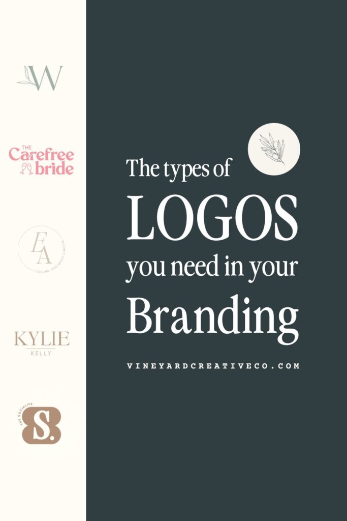
Understanding the different types of logos can help your business create a versatile and cohesive brand identity. This blog will cover the six (yes, six!) types of logos you should have for your brand. Keep reading to learn how each one is unique and where and how to use them in your brand visuals.
📌 PIN FOR LATER 📌
Primary Logo
Let’s start off nice and easy. Every brand has a primary logo. This is the main logo that represents your brand. It typically includes your brand name or a clear representation of your brand, your colors and fonts, and maybe a tagline. This logo should be used the most out of all of the logo variations.
You use it in all the main places your brand shows up: website header and footer, business cards, official documents, social media profile images (unless YOU are the face of the brand, in which case use an image of yourself), email signature, brand presentations, and more.
Whenever using your primary logo, ensure it has enough space and resolution to be clear and effective. For smaller spaces, a different logo is more appropriate.
Secondary Logo
Your next logo is your secondary logo. This is a simplified version of your primary logo. It might simplify or rearrange various elements in your primary logo, such as the icon, text, or tagline. It also often comes in different horizontal, vertical, or stacked arrangements to fit specific spaces a little better. It works well when the primary logo is too complex or doesn’t fit due to size or formatting constraints.
Favicon Logo
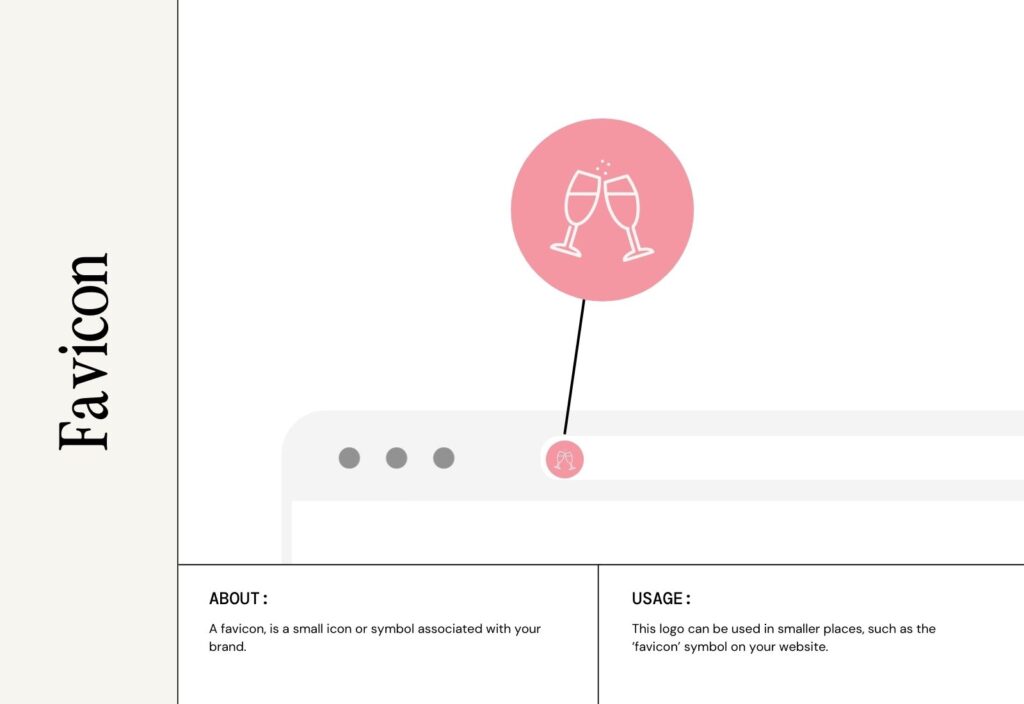
A favicon logo, or brand mark, is a standalone symbol or graphic element taken from the primary logo. Think of the iconic Nike Swoosh – a perfect example of a clean and minimal favicon or brand mark. It’s perfect for app or website icons. If you look at the tabs in your browser window, you’ll see little icons on the left-hand side. These are favicons! It’s very minimalistic and easily recognizable. When people see your favicon, they should know right away that it’s your brand. It’s like seeing the Apple logo and knowing it’s Apple, even though you don’t see the brand name. It’s purely visual, but you recognize it immediately.
Monogram
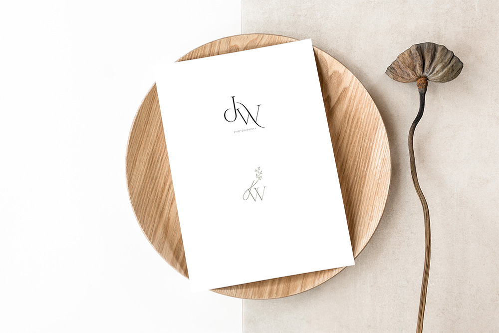
A monogram is stylized initials or letters taken from your brand’s name. It simplifies a brand’s identity into a compact, elegant design. Monograms are especially popular for brands with long names or those that want a sophisticated, minimalist aesthetic. But I think it’s great for most brands to have this type of logo!
Submarks
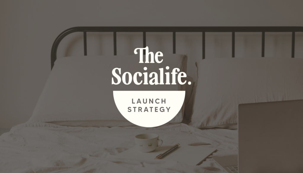
A submark logo is a compact and simplified variation of your primary logo. It takes key elements of your primary logo into a smaller, secondary design for use in limited spaces. It’s usually a compact shape, like a circle or square that fits into small areas. It works great for digital and physical branding needs! A submark acts as a supporting player to your primary logo. It is a flexible branding option that ensures your brand identity shines in every situation.
I like to have a little fun with submark logos while staying on brand, of course! They can be a little more playful and fun than your primary logo (as long as it aligns with your brand). A few fun places to use your submarks are your website footer, brand stationary, and brand merchandise!
Animated Branding Logos
This is a dynamic version of your logo that incorporates some type of motion, such as transitions, effects, or transformations. It’s a very visually engaging representation of your brand. Again, these branding logos can be a fun way to elevate your digital presence and connect with your audience.
Bonus: Brand Patterns, Custom Illustrations, and Elements
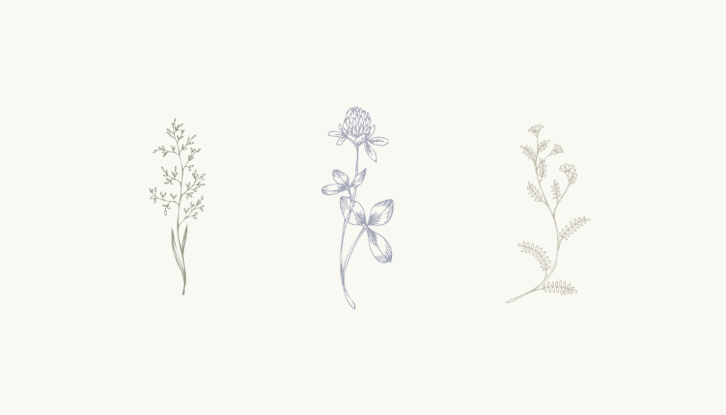
I know these aren’t technically types of logos, but they are visual representations of your brand, so hang with me! Brand patterns, illustrations, and elements are supporting design assets that complement all your branding logos and overall brand identity. They reinforce your brand personality and add depth to your brand design.
They help to unify your brand’s look and feel. By having specific design elements for your brand, you can start to reinforce brand recognition. You are using the same visual elements over and over. You aren’t using polka dots one week and stripes the next. Everything looks put together and professional.
You can use brand elements on your website, social media graphics, physical marketing materials, merchandise, presentations, and more! By incorporating brand patterns, custom illustrations, and design elements, you ensure your brand remains versatile, creative, and recognizable, no matter where your audience meets you.
Design All Types of Logos with Vineyard Creative Co
Multiple branding logos and variations create a holistic brand identity. Different platforms and use cases require different logo sizes and shapes. Having them on hand gives your brand a professional and recognizable look. And it actually gives you more creative flexibility by having multiple logos. You can stay on brand and switch things up sometimes.
Does your brand have enough types of logos? If not, reach out to me! I’d love to design some versatile, beautiful logos for your brand. Check out my branding services if you need a complete brand overhaul.
The Types of Logos You Need in Your Branding
December 5, 2024
Date published:
Filed under

AFFILIATE DISCLOSURE
Some links across my website may be affiliate links, meaning I receive a portion of any sales made through them. I never recommend any product or service that I don't wholeheartedly believe in and use in my own business.
Vineyard creative co is a brand and web design studio based in cincinnati and NKY, serving clients worldwide.
The
Weekly Pour
Fresh samplings of behind-the-design strategy, slow and sustainable marketing nibbles, and a generous pour of honest, unfiltered business takes from one creative to another.
Sola Deo Gloria
Join me for
OFFICE HOURS
ALL GLORY TO CHRIST.
M - F 9am - 5pm