
")


Have you ever thought about why certain brands pick their brand color palette? Is it just because they like them, or is there a strategy behind it?
Well, spoiler alert: There IS a strategy behind picking brand colors.
Brand colors reflect who you are as a business. They embody your brand’s personality, core values, and overall identity. So, needless to say, it’s super important to be intentional about picking brand colors.
Let’s dive into color psychology, key features of a brand color palette, and some tools to help you get started.
📌 PIN FOR LATER 📌
Understanding Color Psychology
Did you know that colors evoke emotions and influence your perception of a brand? Colors carry subconscious meanings that impact your purchasing decisions. By understanding the associations between colors and purchasing decisions, you can strategically choose colors that align with your values and resonate with your target audience.
So, let’s review the emotions each color brings out in people.
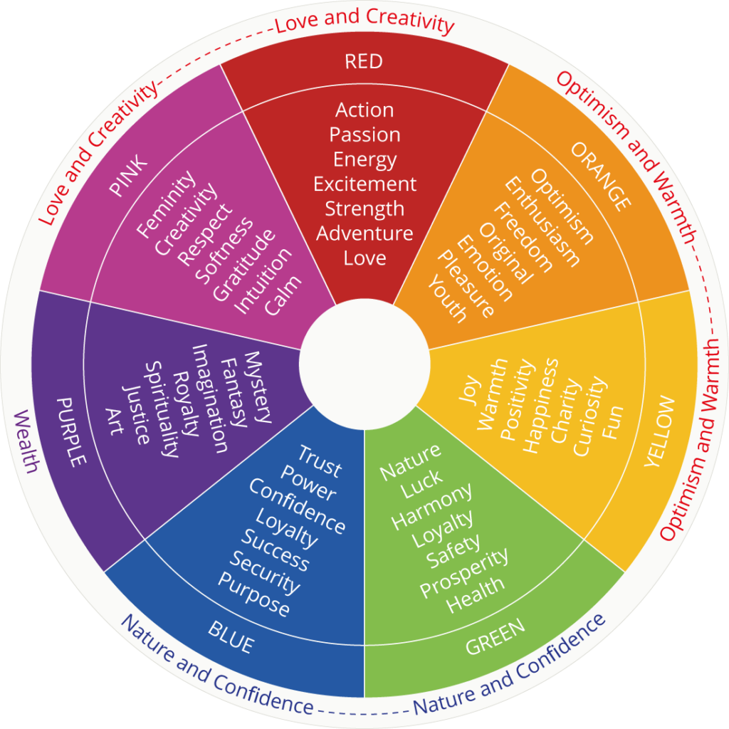
- Red: Energy, passion, urgency, excitement, love, and power.
- Blue: Trust, stability, professionalism, calmness, and intelligence.
- Yellow: Optimism, happiness, positivity, warmth, and creativity.
- Green: Growth, health, sustainability, nature, renewal, and prosperity.
- Orange: Creativity, enthusiasm, friendliness, playfulness, adventure, and confidence.
- Purple: Luxury, creativity, wisdom, sophistication, imagination, and spirituality.
- Black: Elegance, sophistication, authority, power, luxury, and exclusivity.
- White: Simplicity, purity, minimalism, peace, and freshness.
- Brown: Reliability, warmth, ruggedness, wholesomeness, and dependability.
Notice how some colors bring out similar emotions. Black and purple, for example, are both associated with sophistication. On the flip side, pairing two colors together can evoke multiple emotions. Strategically combining colors can reinforce brand messaging.
Popular Brand Examples
I bet you never considered the emotions a brand is trying to evoke in you before ever purchasing their products! Let’s look at some popular brands as examples.
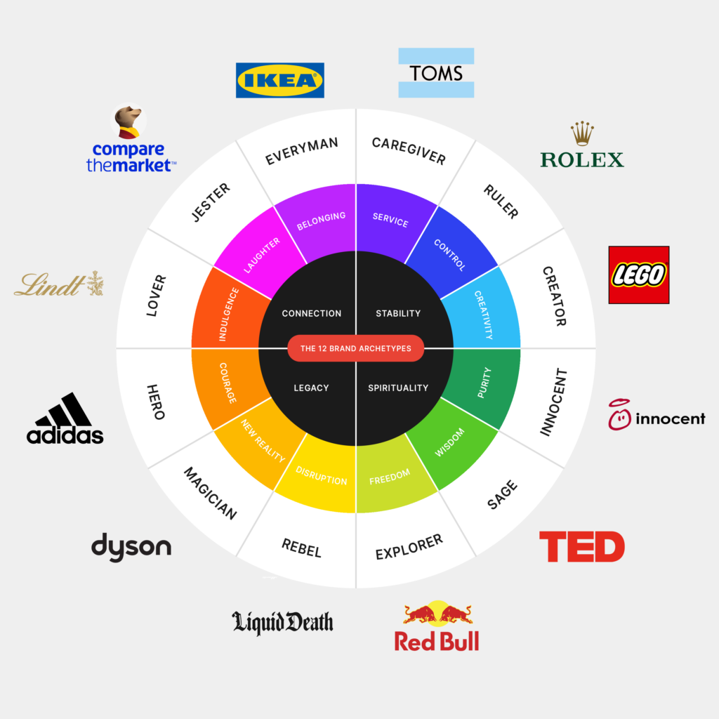
- Spotify: Green is used to symbolize energy, growth, and creativity in music streaming.
- Visa: As a financial institution, it uses blue to reinforce security, dependability, and customer trust.
- Apple: The minimalist black-and-white branding reflects simplicity, innovation, and premium design.
- Coca-Cola: Uses red to evoke excitement, passion, and high energy, reinforcing the brand’s fun and social experience.
- Snapchat: It uses bright yellow to represent youthfulness, fun, and creativity, appealing to its younger audience.
- Home Depot: The bright orange branding is bold, eye-catching, and associated with affordability and DIY enthusiasm.
- Cadbury: Deep purple reinforces indulgence, premium quality, and rich flavor.
There is definitely a strategy behind choosing a brand color palette. Color choices should align with your brand personality and values.
The Essential Components of a Brand Color Palette
Most brand color palettes have between 4-6 colors, but your palette could easily have 15+ colors with different uses. Multiple colors give you more creative freedom to experiment with your brand identity. Instead of sticking to one or two colors and getting tired of them, you have multiple to choose from while staying on-brand.
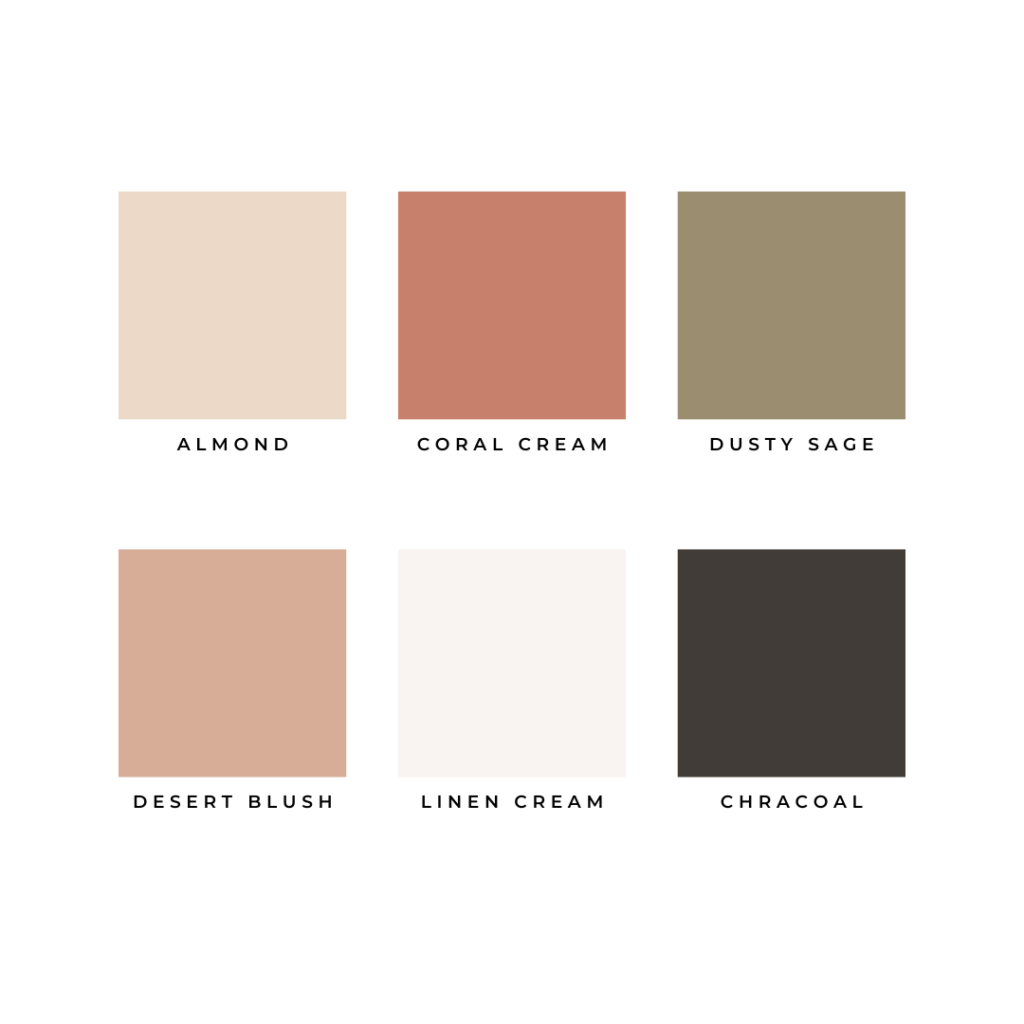
There are a few types of colors you should know about before you start picking your brand colors.
- Primary Colors: The main brand identity colors
- Secondary Colors: Supporting hues for variation and flexibility
- Accent Colors: Used for highlights and calls to action
- Neutral Colors: Backgrounds, text, and balance elements
You should have each of these types of colors in your brand color palette. They add diversity and contrast to your palette. Each color works well together and can be used in a variety of ways.
Choosing Colors That Align With Your Brand Identity
Here is where the strategy comes into play. Picking brand colors goes beyond your personal preference. You’re aiming to create an emotional connection with your audience.
Picking brand colors centers around the people you want to target. If they’re more professional, you might choose colors that make your brand seem more professional. If your audience is laid back and fun, your brand colors should attract them to your business.
Consider these questions as you develop your brand color palette.
- What emotions do I want my audience to feel when they see my brand?
- What are the core values of my brand?
- If my brand were a person, what would its personality be?
- What are the demographics of the audience I’m trying to reach?
- How will these colors look across different channels?
- Does this brand color palette align with my overall brand strategy?
Choosing your brand color palette combines strategy, psychology, and uniqueness. You don’t want your brand to look exactly like someone else’s! Your visual identity should be aesthetically pleasing, differentiated, and meaningful.
Tools and Resources for Building Your Brand Color Palette
Coolors and The Color Palette Studio are two of my favorite tools for picking brand colors. You can easily experiment with different colors to see how they work together to create a cohesive brand color palette.
Coolors is a free tool, so I recommend starting there! However, you have to be careful not to spend too much time playing with the tool! With the generator, you can create hundreds of color palette options, but sometimes that’s too overwhelming. Set a time limit while using this tool – trust me!
The Color Palette Studio has a cost, but it has additional features that will help you create your brand color palette even faster. Created by a designer, the tool gives you built-in design tools like color palette formulas, mood boards, and color contrast checkers.
I’ve used both of these tools for client projects, and they’ve been lifesavers!
Creating a Unique Brand Color Palette
Creating a brand color palette isn’t just about picking colors that you like; it’s about connecting with your audience on a psychological and emotional level. Be super intentional with your color choices. You’ll be stuck with them until you rebrand, and for most entrepreneurs, that’s at least a few years! Spend time developing your brand color palette so you can easily attract your target audience.
Want some help creating the perfect brand color palette? I help clients develop strategic and beautiful brands that attract ready-to-buy ideal clients. Book a discovery call with me to learn how we can work together to design your perfect brand.

AFFILIATE DISCLOSURE
Some links across my website may be affiliate links, meaning I receive a portion of any sales made through them. I never recommend any product or service that I don't wholeheartedly believe in and use in my own business.
Leave a Reply

LOVE What You Just Read?
☕️ buy me a virtual coffee!
I love supporting you with free resources like this! Keep the creativity going and throw some caffeine my way if you want 😉

")


