Your resident Showit brand and web designer. I've helped dozens of creatives stand out online and create a sustainable digital presence.
I'm Laurel.
MY FAVORITE RESOURCES
WORK WITH ME
Browse the SHOP
It’s no secret that Pinterest is a visual platform. Anytime you want to be inspired by new aesthetics, where do you go? Pinterest, of course! This means that you have only a few seconds to grab a users attention amidst a see of pretty pins and inspire them to click on your pin and learn more.
Consistent pinning of your own original content is the secret to gaining traction on the platform. Remember: Pinterest is a visual search engine that can help you drive traffic to your website, NOT a social media platform! To make the most of this platform, you need to create a Pinterest pin that will not only get seen, but connect with your audience. This guide will show you how to create a pin that stands out, gets clicks, and drives traffic to your site.
📌 PIN FOR LATER 📌

How to Create a Pinterest Pin: Start with a visually appealing image.
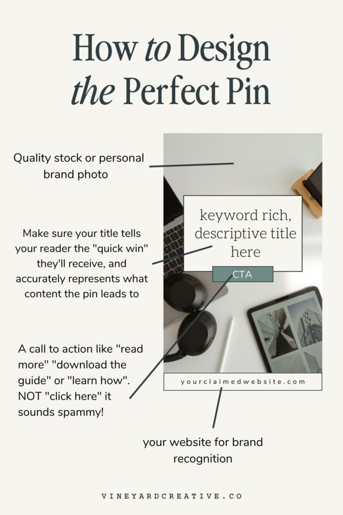
The first step in creating the perfect Pinterest pin is to start with a visually appealing image. This is the most important element of your pin, as it’s what will catch the eye of potential viewers. Choose an image that is high-quality, clear, and relevant to the content you’re promoting. Avoid using blurry or low-resolution images, as they will make your pin look unprofessional. If you’re struggling to find the right image, consider using a stock photo site like Unsplash or Pexels. Alternatively a personal brand photo will create and even more unique and stand-out look to your pin, and connect with your personal brand.

Use clear and concise text overlay.
Once you have a visually appealing image, it’s time to add text overlay. This is where you can provide more context about the content you’re promoting and entice viewers to click through to your website. Keep your text clear and concise, using easy-to-read fonts and colors that contrast with the background. Avoid using too much text, as it can overwhelm the image and make it difficult to read. Use keywords and phrases that are relevant to your content and will catch the attention of your target audience.
Choose the right colors and fonts for your pin.
How to create a Pinterest Pin that is branded.
When creating a Pinterest pin, it’s important to choose colors and fonts that are visually appealing and easy to read. Stick to a color scheme that matches your brand or the content you’re promoting. Use contrasting colors to make your text stand out and avoid using too many different colors, as it can make your pin look cluttered. When it comes to fonts, choose one or two that are easy to read and match the tone of your content. Avoid using overly decorative or hard-to-read fonts. Remember, the goal is to make your pin visually appealing and easy to understand at a glance.
Add relevant keywords to your pin title and description.
How to create a Pinterest Pin that gets seen.
When learning how to create a Pinterest pin that will not only convert, but can actually get seen by your audience, keywords are the secret sauce! Keywords ensures that not only is your pin click-worthy, but it is actually showing up in search results on Pinterest. Use descriptive language and include relevant keywords that accurately describe the content of your pin. Avoid using clickbait or misleading descriptions, as this can lead to a negative user experience and hurt your credibility. Remember, the goal is to attract users who are genuinely interested in your content and drive traffic to your website. Not sure what keywords are or which ones to use?
Include a call-to-action to encourage engagement.
A call-to-action (CTA) is a statement that encourages users to take a specific action, such as clicking through to your website or signing up for your newsletter. Including a CTA in your pin description can help increase engagement and drive traffic to your website. Some examples of effective CTAs include “learn more,” “read more” or “download now”. Try to avoid “click here” as it sounds spammy. Instead invite them on a journey and share what action they should take next to benefit from the information or offer you’re presenting.
Be sure to make your CTA clear and concise, and place it both as a visual on your pin design (a “button-like” graphic is a great choice to increase interactivity) and at the end of your pin description for maximum impact.
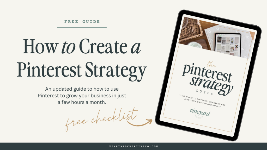
Grab my Pinterest Marketing Checklist
Want to make sure you’re doing the right things each month to keep increasing your traffic from Pinterest? I created this checklist, the same list I use on my own clients accounts!
Looking for more? Check out my latest posts!
- How to Improve Your Website User Experience to Boost Engagement
- The Holistic Client Experience Journey: From Pinterest to Website to Inquiry Form
- My Step-by-Step Guide to Discovering Your Brand Archetype
- The Anatomy of the Perfect Services Landing Page Design
- How to Use Guest Podcasting to Drive Traffic to Your Website
How to Create a Pinterest Pin that Converts
April 13, 2023
Date published:
Filed under

AFFILIATE DISCLOSURE
Some links across my website may be affiliate links, meaning I receive a portion of any sales made through them. I never recommend any product or service that I don't wholeheartedly believe in and use in my own business.
Leave a Reply Cancel reply
LOVE What You Just Read?
☕️ buy me a virtual coffee!
I love supporting you with free resources like this! Keep the creativity going and throw some caffeine my way if you want 😉
The Newsletter that
you'll actually want to open
Each week I share design and marketing tips, a roundup of my favorite resources, and an inside look at entrepreneurship the slow way.
get weekly growth tips in your inbox
work with me learn from me
Vineyard creative co is a brand, web design and marketing agency serving creative service providers. Based in Cincinnati Ohio, serving clients worldwide.
student login
Join the Slow Growth Club
weekly sustainable marketing tips, trends and heart-to-hearts from one creative to another
