Your resident Showit brand and web designer. I've helped dozens of creatives stand out online and create a sustainable digital presence.
I'm Laurel.
The perfect photography website starts with a color scheme that represents you, your brand and your values. Picking colors for Jackie’s Photography website was one of my favorite parts of the project because her vision for her brand was so clear and perfectly tied in photography style. I can’t wait to show you her beautiful and elegant branding and new website!

Choosing Jackie’s Photography Website Color Scheme
Jackie wanted a Showit website for her photography business that truly represented not only her work and brand, but personal values. She wanted something classic combined with warm, earthy, cottage core vibes. Her Pinterest board was filled with botanicals, warm neutrals and subtle textures.


I chose the Sage (HEX #C0BFAC) and Periwinkle (HEX #A6A9B8) colors to represent the calming, classic and botanical feel she was going for. The Creme Fraiche ( HEX #FAF8F3) made for the perfect neutral (always choose 1-2 neutral colors for your brand to make sure you have good background colors and contrast!). Reseda (HEX #969D8A) and Blush (HEX #EDCCB4) brought in a feminine warmth and were perfect to pair with the floral illustrations we used in her logo and submarks!


Designing Jackie’s Showit Website
Sometimes you just *click* with a client and it makes the entire experience delightful from start to finish. Jackie and I connected over on Instagram, and the minute we hopped on a call, I knew I was going to LOVE working on her branding and website! I felt like we had known each other for years, and she was already a dear friend. Don’t you just love that feeling?

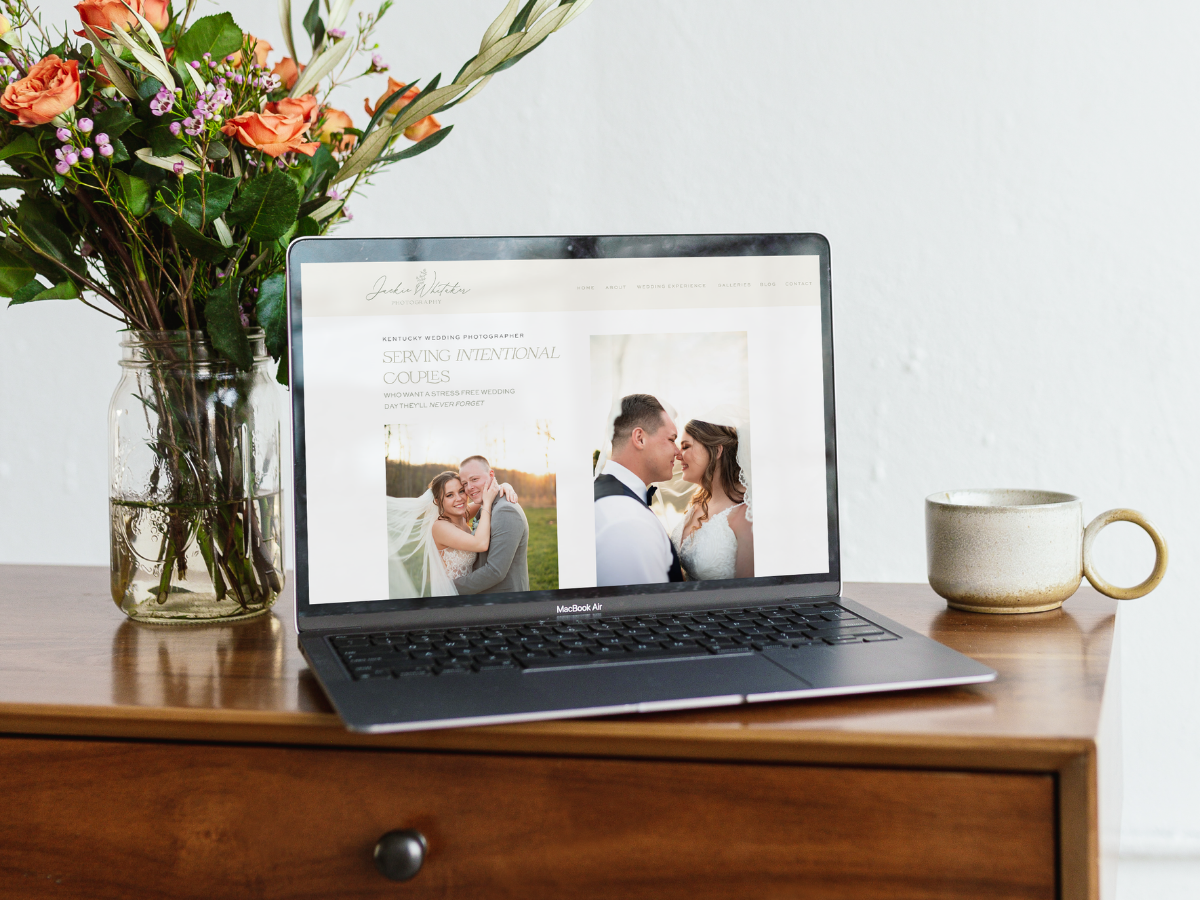
Jackie’s current Pixieset website was working for her, but it wasn’t giving her visitor’s and idea of the level of support and the personalized experience they’d receive when they worked with her. By moving her to the Showit platform I was able to deliver a website that was exactly what she wanted!

After settling on a color scheme and her brand visuals, it was time to work on creating her website! Jackie chose a beautiful template from Northfolk to be customized. While I love creating custom websites as part of my Website in a Week services, template customization is also a favorite of mine. It can be a great jumping off place, and by the time we’re finished, you’ll have a beautifully unique website!
The key to a successful website project in my opinion is all in the prep work! I plugged Jackie into a custom Notion portal to start filling out her brand questionnaires and DIY copywriting guide. Jackie was a whiz at filling our her copy prompts and being descriptive in her questionnaires! Is there a place to give review for clients? If so I would give Jackie 11/10 for being the BEST!
Showit SEO for a Wedding Photography Website
Including proper and strategic SEO is extremely important to me as I design, and it should be to you too! Your website should be a powerful tool that brings you leads long after it’s created. By diving into some keyword research and choosing keywords that would help Jackie rank, we made sure to set her up for success by focusing on key phrases like “Kentucky Wedding Photographer”, “Lexington KY photographers” and more words that were high ranking with a low search difficulty based on Ubersuggest.
Wondering how to set up your own website for SEO success? Check out my FREE Showit SEO checklist when you’re creating or updating your website!

A Word from Jackie
You’ll get an inside look at what kind of person Jackie is by this incredibly sweet feedback she left after her website was finished:
If you’re looking for a sign to work with Laurel, this is it. I was a photographer frozen by overwhelm and decision paralysis at the thought of refreshing my brand and website. Enter Laurel. Laurel gave me the help and encouragement I needed to dig into the core values of my business. She then took those core values and truly brought them to life in beautiful branding and a stunning website. Not only did this new branding and website help my dream clients know more about my business, but they gave ME so much clarity and a new vision of what my business is all about. Laurel was so thorough, organized, kind, and a true anchor throughout the whole process. She has a true gift. Don’t be overwhelmed by your brand and website anymore. Let Laurel use her gifts and talent to help you, like she helped me!

Ready for a New Photography Website?
I’d love to help you bring your vision to life and start marketing sustainably with a brand new website! I’m currently booking spots for my signature Website in a Week service which includes a mini brand kit, basic SEO implementation and a 5 page website fully designed for you in ONE WEEK! Learn more or hop over to my contact page to connect and learn more.
Looking for more resources for sustainable marketing that will get you more bang for your buck? Check out my resources page for templates and guides to help you hop off the “content creation hamster wheel” and start marketing in a way that will help your business thrive for years to come.
*This blog post may contain affiliate links. I never recommend anything I don’t personally love and use myself for my clients or in my own business!
Elegant Wedding Photography Showit Website
August 14, 2023
Date published:
Filed under

AFFILIATE DISCLOSURE
Some links across my website may be affiliate links, meaning I receive a portion of any sales made through them. I never recommend any product or service that I don't wholeheartedly believe in and use in my own business.
Vineyard creative co is a brand and web design studio based in cincinnati and NKY, serving clients worldwide.
The
Weekly Pour
Fresh samplings of behind-the-design strategy, slow and sustainable marketing nibbles, and a generous pour of honest, unfiltered business takes from one creative to another.
Sola Deo Gloria
Join me for
OFFICE HOURS
ALL GLORY TO CHRIST.
M - F 9am - 5pm